SIMPLE PHOTO BASHING TUTORIAL
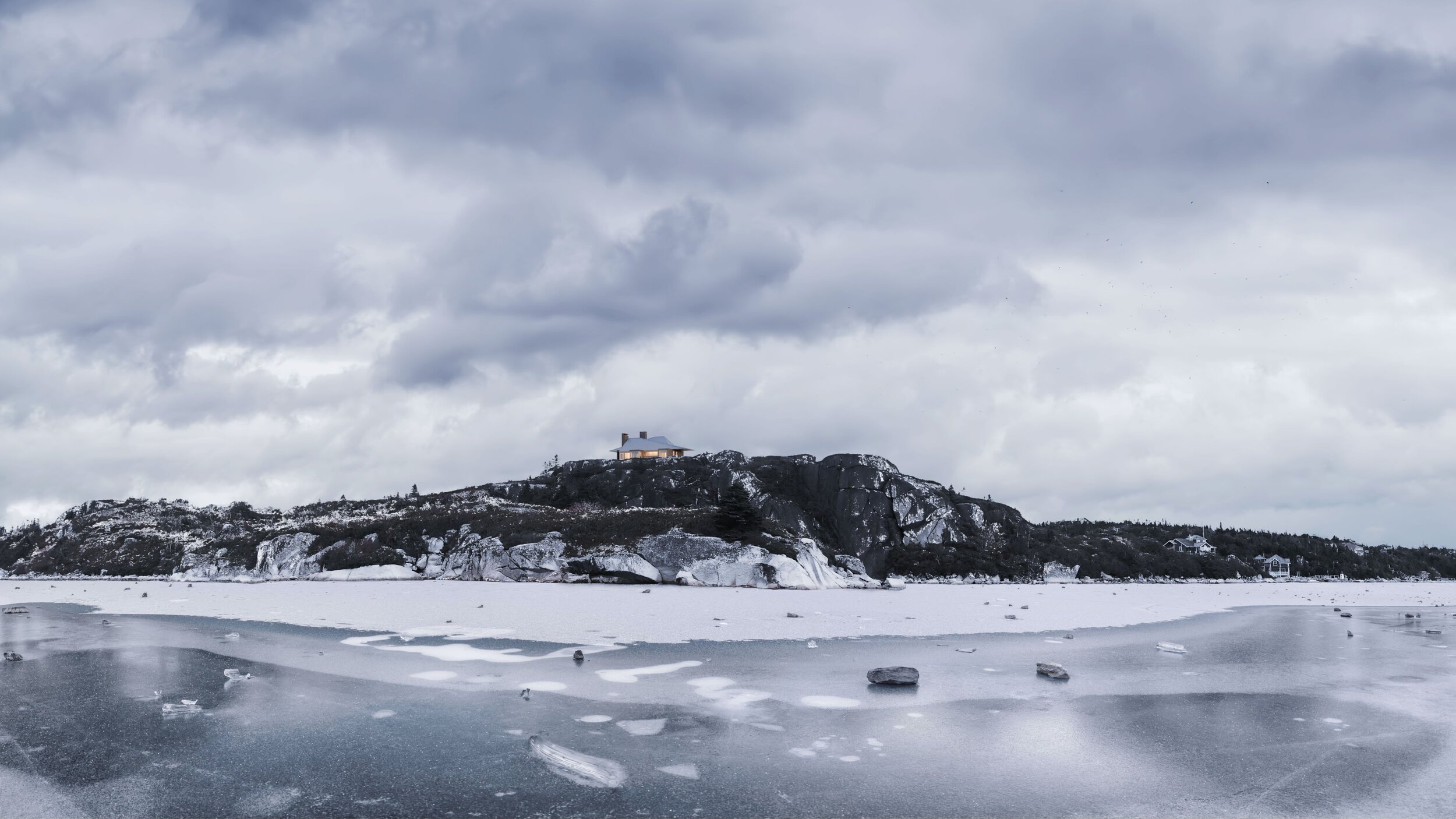
After I was done with this image, I realised again how much easier it is to achieve the great results using photographs instead of sculpting and tweaking everything in 3D. Production of this image took me about 5 hours, most of the time was spent looking for the “right” ice image, but once I found it, putting all together felt like a walk in the park.

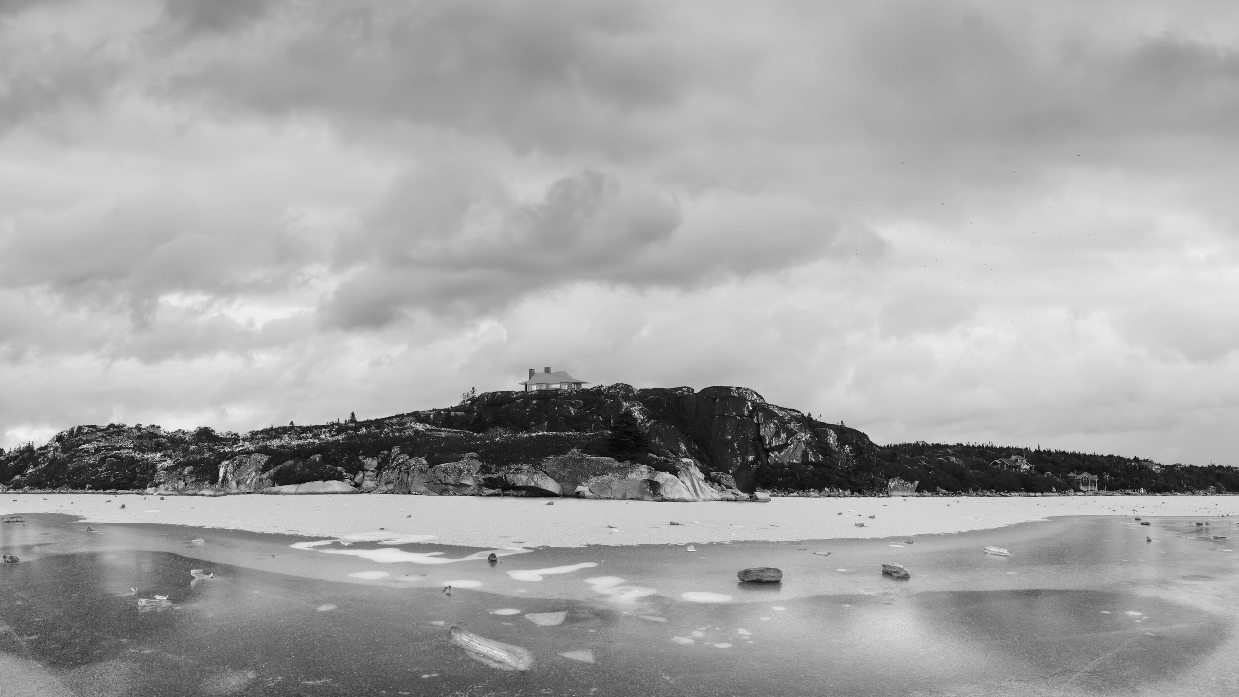
final photo bash
WHAT IS PHOTO BASHING?
“Photo bashing is a technique where artists merge and blend photographs or 3D assets together while painting and compositing them into one finished piece” - that’s a quote from conceptartempire.com that sums it up into one sentence beautifully. I wish more of us tried to practice this technique instead of relying on 3D so heavily. No matter how good and photo-real our 3D renderings get, you can't beat the real thing and on the plus side - it is much easier and faster once you get the hang of it.
For those interested to dive deeper than what I'm about to show here, I highly suggest tutorials by Anthony Eftekhari. They may seem a bit dated video quality-wise; still, the content is more relevant today than it has ever been in our industry.
PREPARATION
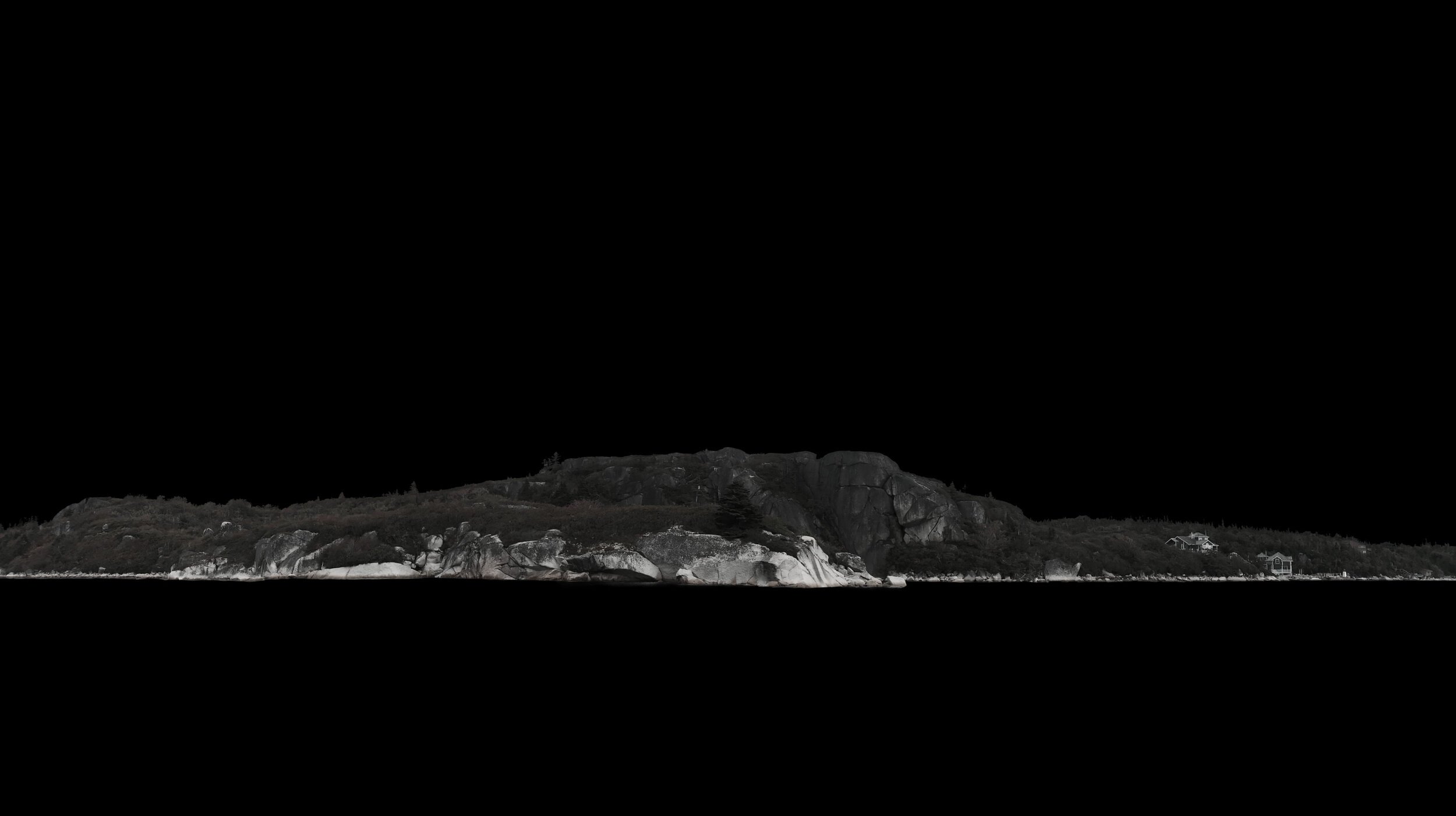
original cliff image that was provided by architects

early stages of 3D work
I had an image of a cliff provided by an architect, the only problem was - it was taken in early fall. To match the rest of the winter images, I needed to model the whole cliff part in 3D or manipulate an existing photo to look like it was shot in winter. I tried to do it in 3D at the start, for the most part, to make it sunny as the rest of the set was, but it was just too much of unnecessary work involved, and I choose latter.
Cliff image was shot in a resolution of 3849x1920, which isn’t bad, but it ain’t good either for a massive view like this. To give me more playground, I made an image twice as large (7698x3840) using Gigapixel AI from Topaz Labs. It’s a neat software that comes handy in situations like these.

Since the cliff image is vast and panoramic and was shot in overcast, I wanted to find a frozen lake/river photo that matches all these characteristics and is as large as possible. I like to scout sites like Flickr & Unsplash for these kinds of tasks, there are many other royalty-free sites you can find, but these two are my favourite.
After lots of try-on’s, I ended up with the image above that was found on Flickr, somehow this “naked“ ice was working the best, so I leaned towards it.

Speaking of Skies - I have tons of images in my library. On the plus side, each HDRI usually is coming with matching backdrops included, so you can have an easy starting point there. I’m a massive fan of free skies package by Slashcube, which was used here as well.
Part of this preparation can be skipped if you invest time beforehand in searching and collecting references.
PROCESS
Before we begin, I will quickly mention that I work in Affinity Photo. Still, all of this process can be easily recreated in Photoshop.
sky selection and removal
water selection and removal
I started with cliff image since that was the main element in our visual. The first step was to remove unnecessary stuff - sky and water. Sky portion was removed using “Selection Brush Tool“ which is fast and reasonably clean. Water was selected using “Lasso Tool“ and converted into a layer mask.
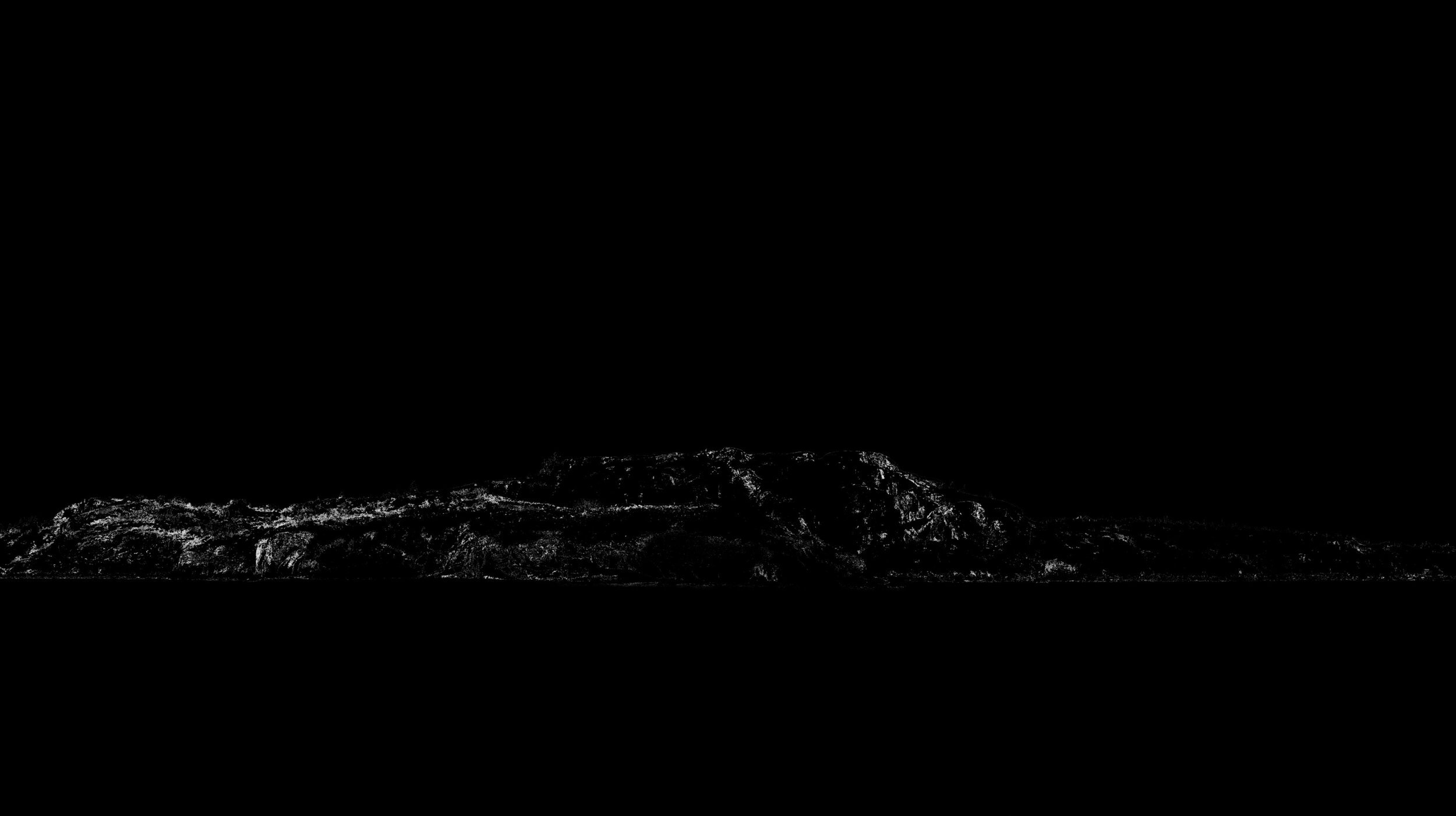
edge quality after sky removal
element selection before clone stamping
result after clone stamping
After all the cutting, this element needed some edge treatment. Make sure to check edge quality by placing a solid black layer underneath your cut.
For the upper portion, it was selecting a whole element and “Clone Stamping“ along the edge, which at the end gives you a nice and clean result. Water was as good as it was, I just unmasked some of it to blend better with ice image.

desaturated cliff image

simple saturation shift
After finishing all the cleaning, I applied the HSL (Hue&Saturation) layer to it and dramatically desaturated cliff element. This is the first step when converting summer/fall into winter - almost getting rid of all the green.
adding ice image
clone-stamping, desaturating and brightening ice image
Next up was ice image, which in this case was Plug&Play (besides some clone-stamping on the right side and blending in with cliff). After it was placed and clone-stamped, it was desaturated and brightened up. While cliff and ice look way off here, it was a good starting point before moving into adjusting values (brightness) and colour.
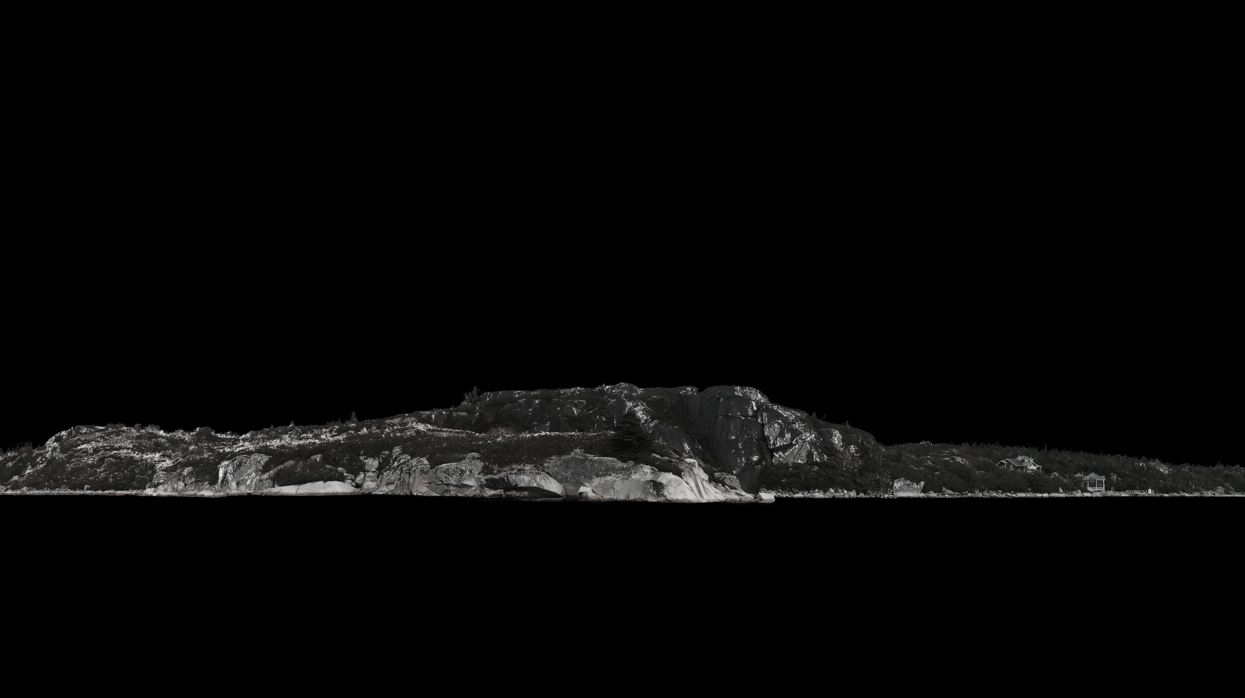
all major elements in place (except house)
The sky was the last missing element in this composition (besides the house of course). Without going into detail of me trying out multiple skies (obviously I did and you should as well), I will show you the final result instead. Since it was initially pretty desaturated, this is how it looked all-together, dark, but pretty neat.
ADDING MISSING ELEMENTS
Before moving to adjustments, it was left to add a rendered house and snow to blend in that landscape better.
To add snow I used a tool called “Select Sampled Colour“ under the “Select“ menu in Affinity, in Photoshop it is called “Colour Range”.
It selects spots within the same colour range you pick across your element. When your desired range is selected, create a new layer and fill the selection with white. If it doesn’t look right, redo it. I found that selecting lower “Tolerance“ and creating 3-4 layers of snow instead of trying to do it all at once did work for me best. Later on, I just played with opacity to get to the result I want. To better understand how summer to winter works follow this tutorial.
Adding house was straight forward - the camera was already pre-set and did match perspective correctly. Left to match was HDRI with light in photo-bash (overcast) and to add some warm & welcoming interior lights in the building.
VALUE/COLOUR CORRECTION AND FINAL ADJUSTMENTS
It is hard for the eye to notice value (brightness) differences if colour is present. Still, once you nail the value - a colour becomes easy. On top of all layer stack, I create HSL ( Hue & Saturation) layer set in “colour“ mode and completely crank down saturation (-100%). Instantly I can tell that sky needs to be much brighter (sky should be brighter than the ground on all occasions). After brightening it up, suddenly it comes to life.
Turning off HSL layer reveals a cliff's problem - its off colour. It's fixed by creating simple, clipped blue overlay layer. Same goes for building - I add Levels & HSL layers, nail value and colour, and suddenly it blends in.
On top of all layer stack, I add LUT from Illusive Images. It’s a small package containing 3 LUTs, and these are all I’ve been using for the past couple of years. You can download them HERE.
Lastly, I add some blue colour back into the image. To contrast it better with building, I warm up and add a slight glow to those interior lights.
To finish it all off I add some vignetting to lower portion of the image, and it’s all done!
FINAL NOTE
I usually don’t work in this particular sequence, I wrote it this way to have some logical structure. In my work, I tend to jump between colour correction, cutting things out, trying different skies etc., so that I don’t end up with unnecessary stuff at the end.
Any questions - ask them below.
Cheers!
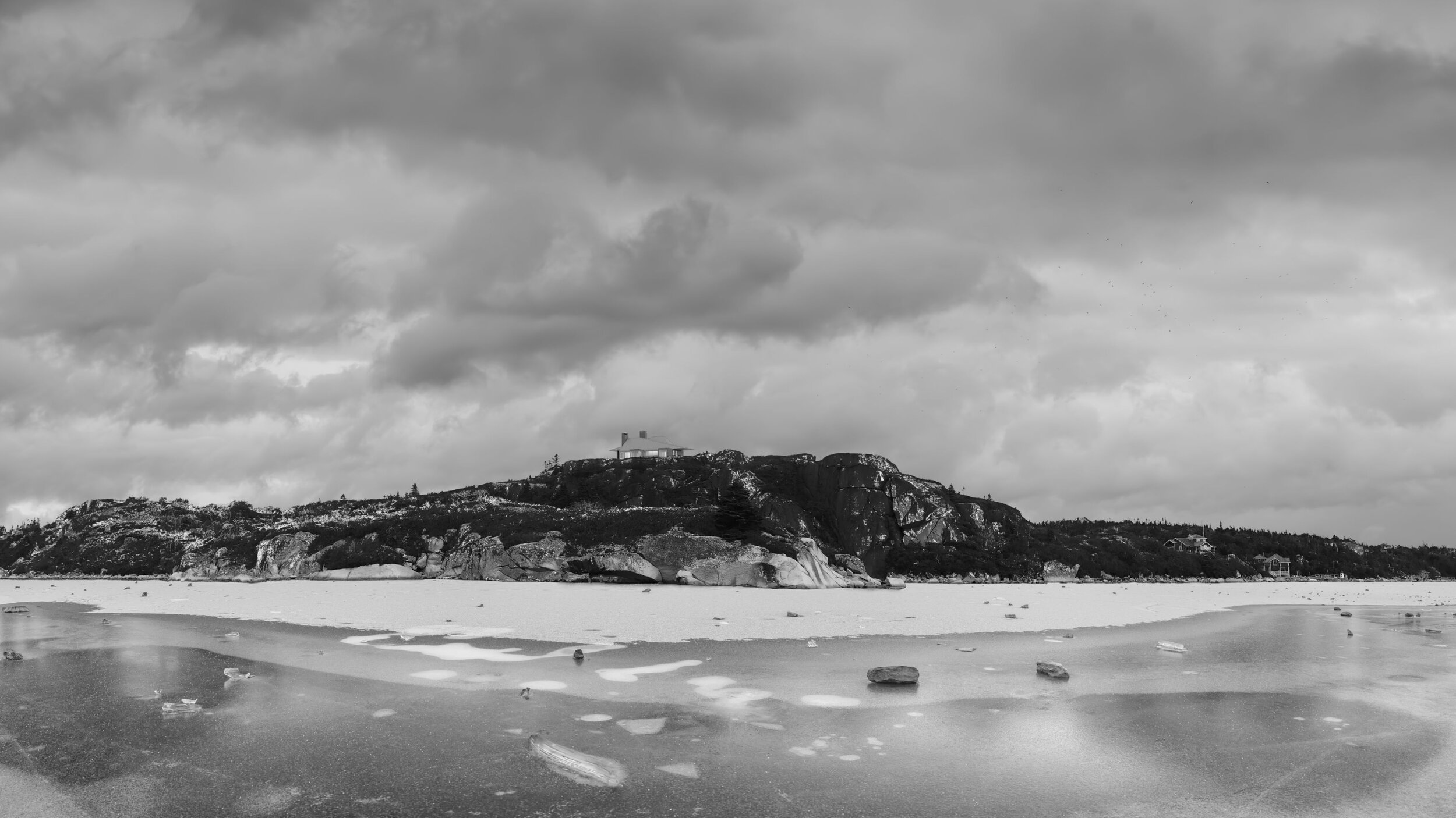
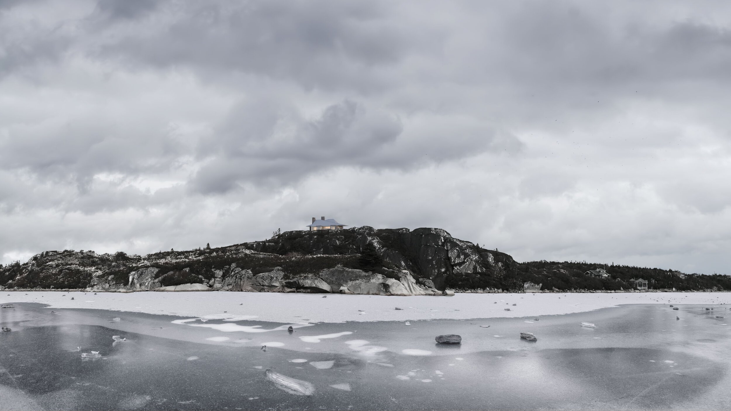
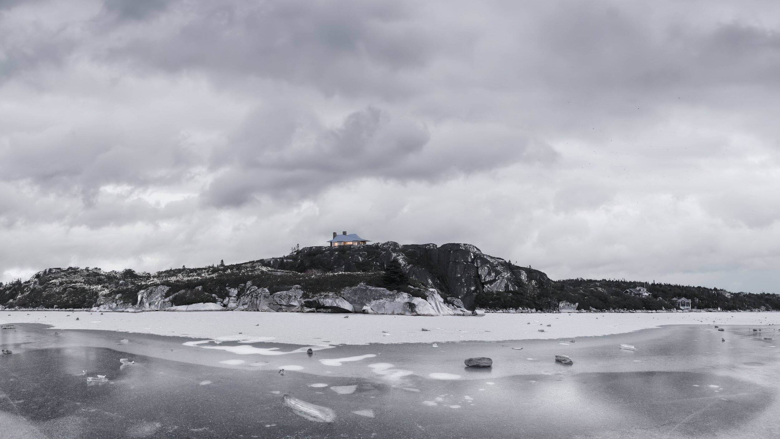
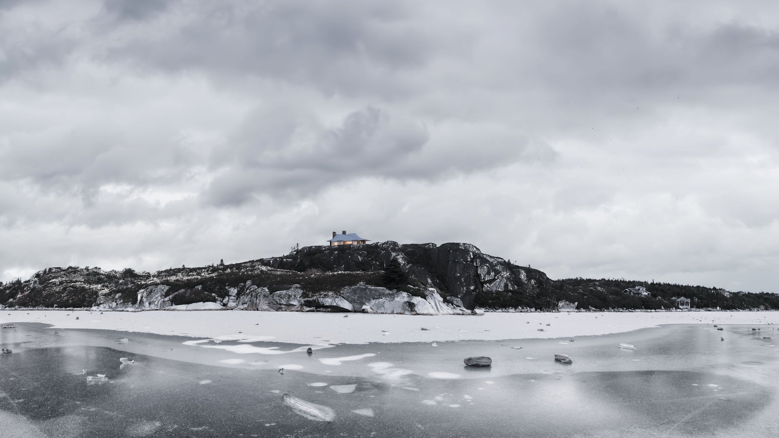
FINAL IMAGE
final image
close-up